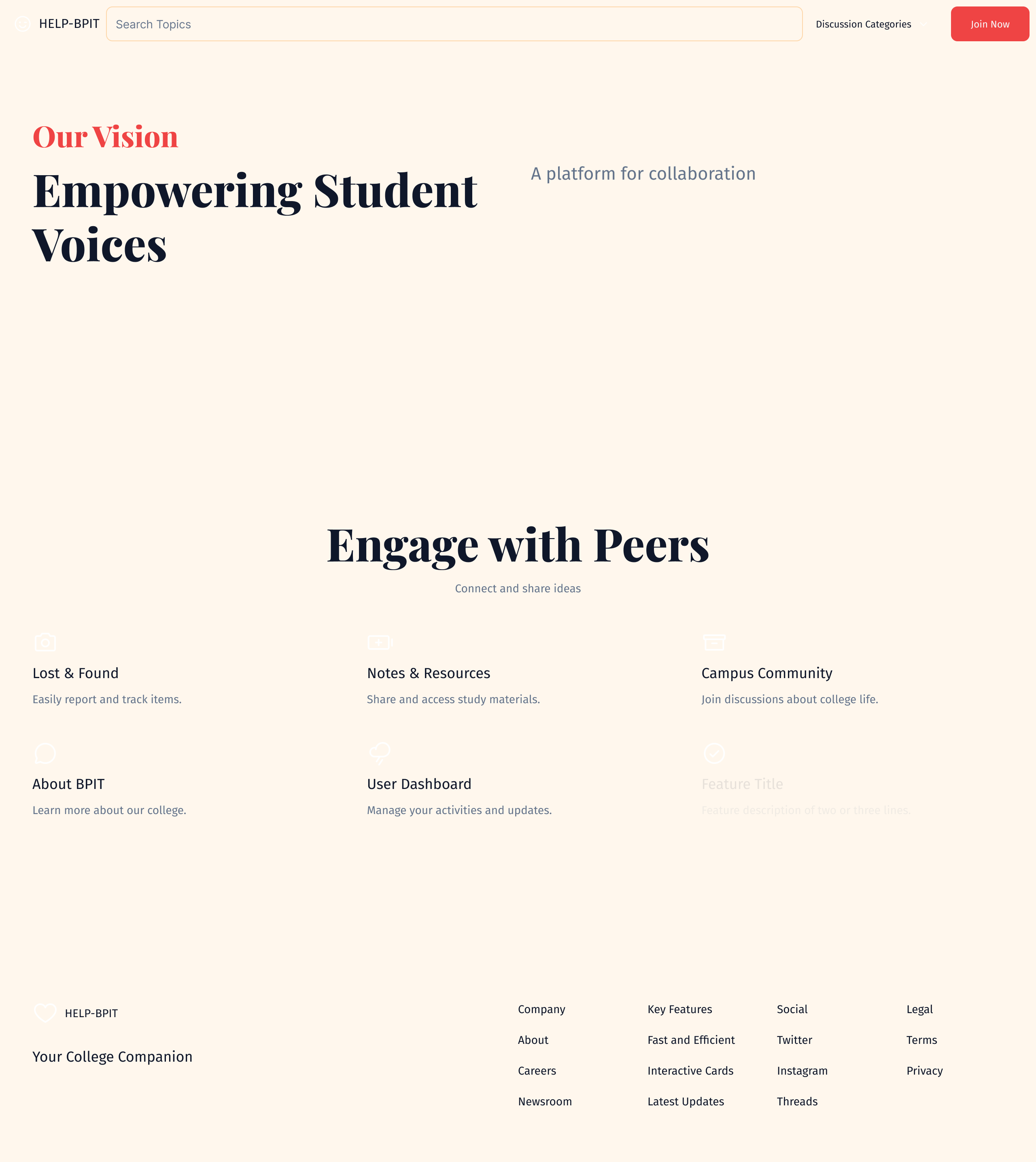
Dynamic college community hub website
Prompt: "Design a dynamic and user-friendly web app for a college named 'HELP-BPIT.' The site should feature five main sections, each with a distinct function but tied together by a consistent, modern design language. Use a vibrant yet professional color scheme of deep blues and warm oranges, balanced with neutral tones like white and light gray to create a visually appealing and inviting interface. The layout should be clean, easy to navigate, and fully responsive across devices, ensuring that students, faculty, and visitors can access it seamlessly on desktops, tablets, and mobile phones. 1. Open Forum Section This section should function as a lively discussion space where users can start conversations on various topics, post questions, and engage in debates related to college life and academics. The design should feature a card-based layout for discussion threads with a prominent title, brief descriptions, and the number of replies and upvotes for each post. Implement a threaded comment system to keep replies organized and easy to follow. Users should be able to upvote, comment, and share posts. Visually, use icons for categories like academics, events, campus activities, and more to make the forum approachable. 2. Lost and Found Section In this section, users can report lost or found items. Each item post should allow for descriptions, image uploads, and details like the location and date. The design should be simple and clear, with filters that let users sort by categories (e.g., electronics, clothing, books) or search directly by item name. Use a minimalistic form layout, with large input fields and clear CTA buttons like 'Report Lost Item' or 'Found Something?' Notifications or alerts should be designed to be visually prominent so that users can easily track items they are interested in. 3. Notes Sharing & Book Sharing Section This collaborative section is for students to share class notes, study materials, and even books. Design a grid layout where notes and books are displayed as clickable cards with titles, brief descriptions, and subject/course tags. Users should be able to search by keywords, filter by subject, and upload their own materials using a simple drag-and-drop or upload function. Use icons and a subtle color scheme for the cards to make the content easily scannable. Focus on simplicity in file sharing and download options, ensuring a smooth experience. 4. About the College Section Create a visually appealing, informative page about BPIT College. Use large hero images of the campus or important events to make this section lively and welcoming. Incorporate sections on the college’s mission, faculty, departments, courses, and facilities, using a clear, structured layout with large headings and body text that’s easy to read. This page should be highly visual, with icons, infographics, and imagery that match the overall color scheme, ensuring it feels engaging yet professional. 5. User Dashboard Design a personalized user dashboard where users can manage their activity across the forum, lost and found, and notes/book sharing sections. This dashboard should be clean and intuitive, with easily accessible menus and notifications for new interactions, messages, or updates on posts they’re following. Ensure the interface feels modern, with a consistent design in buttons, typography, and icons. Across all sections, focus on clean, consistent typography, intuitive navigation, and well-placed icons. The overall experience should feel cohesive and modern, with thoughtful use of the color palette to enhance user engagement."
