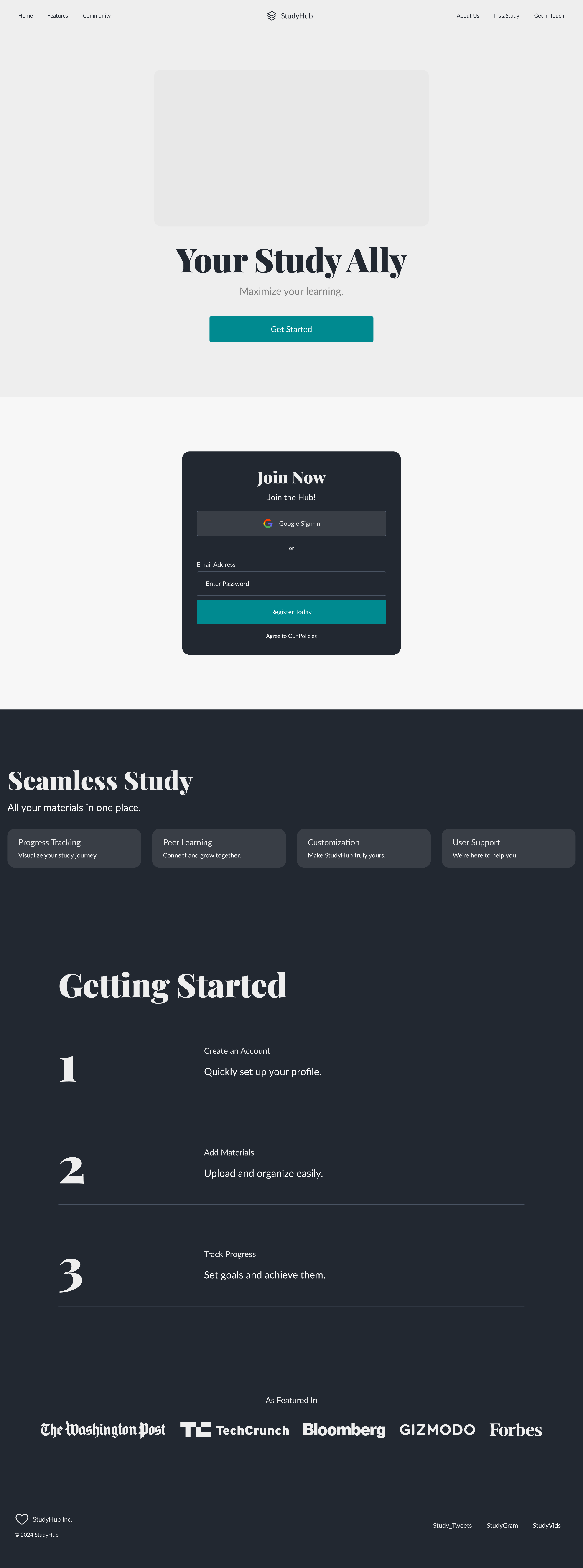
Studyhub mobile app website
Prompt: Sure! Let's design a UI/UX for a fictional mobile app called "StudyHub," which helps students organize their study materials, track their progress, and connect with peers for collaborative learning. Here's an overview of the design: 1. Splash Screen: Clean and minimalist design with the StudyHub logo. Brief loading animation or motivational quote related to studying. 2. Sign-In/Sign-Up Screen: User-friendly interface with options for signing in or creating a new account. Input fields for email/username and password. "Forgot Password" link for password recovery. 3. Home Screen: Welcome message with the user's name. Navigation menu icon for accessing different sections of the app. Quick access buttons for adding study materials, setting study goals, and connecting with peers. Overview of recent activity, such as recently added study materials or upcoming deadlines. 4. Study Materials Screen: Organized layout with categories such as Notes, Documents, Videos, and Links. Option to create folders or tags for better organization. Thumbnail previews or icons for each study material. Search bar for quickly finding specific study materials. 5. Progress Tracker Screen: Visual representation of study progress, such as a progress bar or chart. Breakdown of study time by subject or topic. Option to set study goals and track progress towards them. Reminders or notifications for upcoming study sessions or deadlines. 6. Peer Collaboration Screen: Feature to connect with peers for group study sessions or collaborative projects. Searchable directory of other StudyHub users based on shared interests or courses. Messaging or chat functionality for communication between users. Option to create or join study groups for specific subjects or topics. 7. Settings Screen: Personalization options such as profile picture, display name, and bio. Account settings for managing email/password, notification preferences, and privacy settings. Theme options for customizing the app's appearance (e.g., light/dark mode). Help and support resources, including FAQs and contact information. 8. Feedback and Reporting: Feature for users to provide feedback on the app's usability and suggest improvements. Reporting functionality for flagging inappropriate content or issues with study materials. 9. Onboarding and Tutorials: Guided onboarding process for new users, with tutorials on how to use key features. Tips and best practices for effective studying and using the app efficiently. 10. Accessibility Considerations: Ensure that the app design is accessible to users with disabilities, with features such as screen reader compatibility and adjustable text size. Use high contrast colors and clear typography for readability. 11. Visual Design Elements: Clean and modern design with a calming color scheme to promote focus and concentration. Consistent use of icons, buttons, and typography for a cohesive look and feel. Engaging illustrations or animations to make the learning experience more enjoyable. By incorporating these design elements, StudyHub can provide students with a user-friendly and visually appealing platform for managing their study materials, tracking their progress, and collaborating with peers. MOBILE APP
